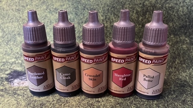
I’m usually a little behind the latest trends, so I finally picked up a few Army Painter Speed Paints for a trial.
I picked up five colors from Critical Hit Games in Abingdon, Maryland. I was actually expecting to do a test of some skeletons, so that’s why the pallid bone, and I’m honestly not sure why I chose red. The brown and the green, I thought, would be a fair test for some “traditional” wood elves.
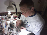
Since I would like to get an elvish army on the table as part of my plan for the Portable Fantasy Campaign, I pulled out a dozen 1/72 scale Caesar Elves earlier this week and washed them up as usual. Yesterday after work I primed them with a Reaper brush on white primer, in keeping with the general instruction to use these over white. I pulled out a cheap brush from a Dollar Tree craft section, which was unmarked, but about the size of a typical #2 round brush, since I didn’t want to risk any unforeseen side effects with a more expensive brush. I also pulled out an oatmeal container lid to use as a palette. I then queued up the latest episode of the Yarkshire Gamers Reet Big Wargames Podcast (which is appropriate because the host always asks guests what they think about contrast/speed paints), and started brushing.
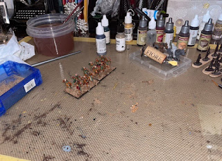
Before the 1.5 hours podcast was over, I had paint on everything, with figures and sand on bases. I did touch up some belts and metallics with conventional paints within that time block. The Speed Paint seems to do a reasonable job of staying where you put it, so you can probably paint trousers first and a tunic after, if that made sense. The one point that I should have considered before starting (but did not) is that the lighter colors do not cover darker colors. Add that to the paint staying put once applied and it is clear that the correct order of application is “lightest to darkest” rather than “innermost to outermost” or “bottom to top”. So I should have started will all “pallid bone”, then done the flesh tone, then the brown, red and green in any order that made sense. That would have required me to consider the whole paint scheme first rather than starting (as I did) with the cloaks (because I knew what color I wanted them to be).

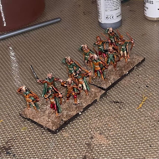
I had not necessarily intended to paint figures entirely with Speed Paints. If I had thought about this in advance, I would have bought one more neutral-ish brown or light green or something “elvish”. Once I got started, though, I ended up “leaning in” to the speed aspect. As it was, half the figures got green tunics and brown cloaks (with the other half the opposite), half of the figures got pallid bone trousers and the other half got red, and the brown cloaks got red quivers while the green cloaks got hardened leather quivers.
I had a certain amount of touching up to do. I usually paint over black primer so that a missed bit looks like a shadow, so I was not surprised to find that white primer with speed paints works about the same way as white primer with conventional paints. I ended up tapping any white bits in out of the way places with the hardened leather, as being the most inconspicuous.
Once finished, I broke the figures off the craft sticks I use to handle them with (4 to a stick) and glued them to the movement stands with the usual Walthers Goo. As soon as they had set enough to handle the base I added the usual mix of white glue and Nova Scotia traction sand to disguise the integral bases. Since my white glue is fairly wet at that point, and since this was a speed test, I used a dropper bottle of water to wet the sand before it finished setting so that capillary action would pull enough glue to the surface to get some flock to stick. In the interest of speed I did not add any additional small scatter (rocks, tufts, etc.) to the bases.
I then left them to dry overnight, and sprayed them with the usual Krylon Low Odor Matte Varnish I customarily use. This does not appear to have had any adverse effects.
If you tap on the pictures, I have uploaded larger versions of them as usual, so that you may draw your own conclusions about whether this worked. Keeping in mind that the whole purpose is to put tabletop quality units together quickly, it is to be expected that they are not optimized for close-up viewing.
Just for my own amusement, if I were trying to optimize 1/72 scale figures for closeup viewing, they would end up looking something like this sorceress and her guards I painted earlier this year (pre-basing…).
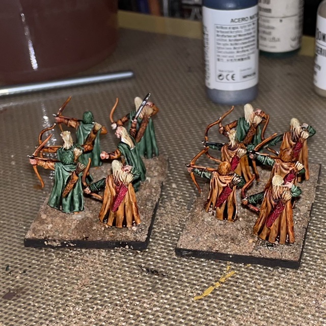
I decided to set them up next to some of the elves I did five or six years ago using my usual techniques. Now, I will not that I did not really like the way these figures came out vis-a-vis how I had envisioned them. They were done as regular speed paints, and I see that I skipped eyes and other fine detail not visible at table viewing distances.
And here is one stand of each with my elvish commander stand, which was painted as though each figure was intended to be viewed as an individual.
So, what’s the overall verdict? I was pleasantly surprised to find that the Speed Paints seem to work as advertised, and, with a little more practice for the peculiarities of the paint, would allow you to throw some basic units on the table pretty quickly. It’s probably worth getting a few more colors, and, just for fun, trying them out with some 25/28mm figures as well.


I have some of the Speed Paints as well as some Scale 75 Instant Colours to try, but my efforts so far have been limited to Contrast Paints from GW. From what I can gather, they all work in a similar way. I've found they work better with less paint as this avoids the pooling. I would like more definition of areas, as you get from black undercoat. I'm thinking of applying a wash, possibly Dark Tone, over the white undercoat. Experiments required!
ReplyDeleteMy efforts can be seen here:
http://aufklarungsabteilung.blogspot.com/2021/07/playing-around-with-contrast-paints.html
Neil
I considered using an Army painter Strong Tone wash in the crevices/color separation areas; it might make more sense to do that first, over the primer. Thanks for the blog link!
DeleteI'm slightly dismayed to see how well they worked on a first go. I put a lot of effort into getting that effect in the 80's and 90's with standard artists' acryllics!
ReplyDeletebtw That NS traction sand is now extinct. Choose carefully how you use the rest!
We've still got enough for a while, but when the supply gets lower, I guess we'll build up the base with some other color of sand, and save this stuff for the top layer where it shows.
Delete